![]() THE BRIEF: Ian is a close up magician and felt his branding wasn’t distinct enough from the competition. He wanted to put a card into a prospective client’s hand, that would give them an expectation of cost and level of his expertise.
THE BRIEF: Ian is a close up magician and felt his branding wasn’t distinct enough from the competition. He wanted to put a card into a prospective client’s hand, that would give them an expectation of cost and level of his expertise.
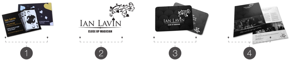
![]() Ian’s old business cards – Whilst Ian wanted a departure from the old branding, he wanted to keep the playing card suits in there somewhere. The question was how.
Ian’s old business cards – Whilst Ian wanted a departure from the old branding, he wanted to keep the playing card suits in there somewhere. The question was how.
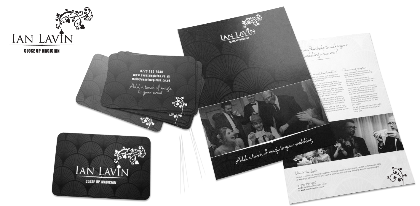
![]() New logo – We whittled down a number of concepts into this final version. The familiar hearts, clubs, diamonds & spades are there still, but emerge in a flourish,emulating the reveal of a magic trick.
New logo – We whittled down a number of concepts into this final version. The familiar hearts, clubs, diamonds & spades are there still, but emerge in a flourish,emulating the reveal of a magic trick.
![]() New business cards – The rounded corners echo playing cards, hopefully subtly. The background wallpaper echoes the settings a black tie event and a matt laminate give them a soft, tactile feel.
New business cards – The rounded corners echo playing cards, hopefully subtly. The background wallpaper echoes the settings a black tie event and a matt laminate give them a soft, tactile feel.
![]() Fyers – Photography, typography and (lack of) colour expand onIan’s branding. We decided to keep it monotone for it’s simplicity and use the space to show Ian and the setting he works in.
Fyers – Photography, typography and (lack of) colour expand onIan’s branding. We decided to keep it monotone for it’s simplicity and use the space to show Ian and the setting he works in.
THE RESULTS: Designed for digital print, Ian’s ongoing costs are low and print turnaround is quick. More importantly, Ian now feels confident when marketing himself.
![]()